Powercrunch
CPG
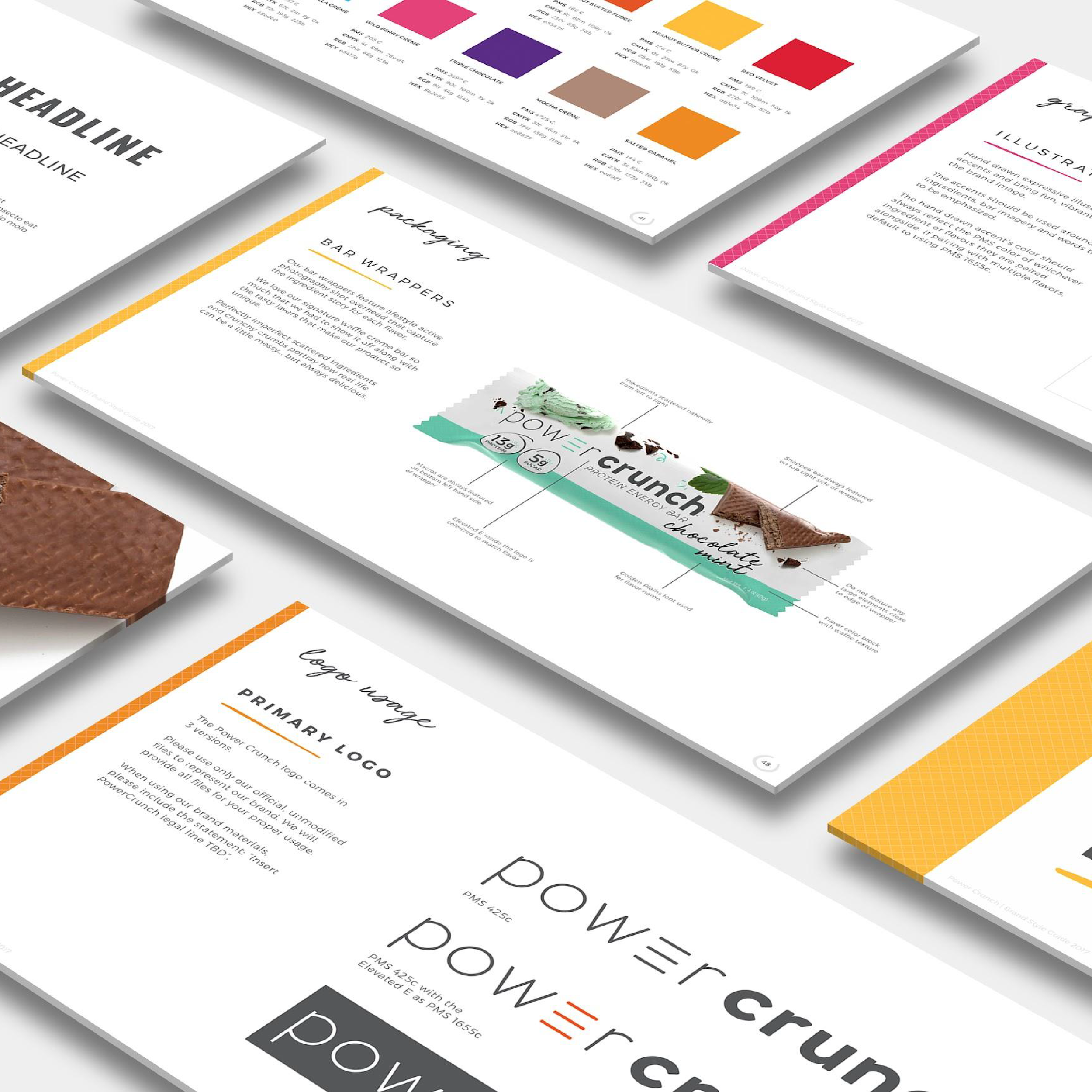
Visual Identity // Packaging
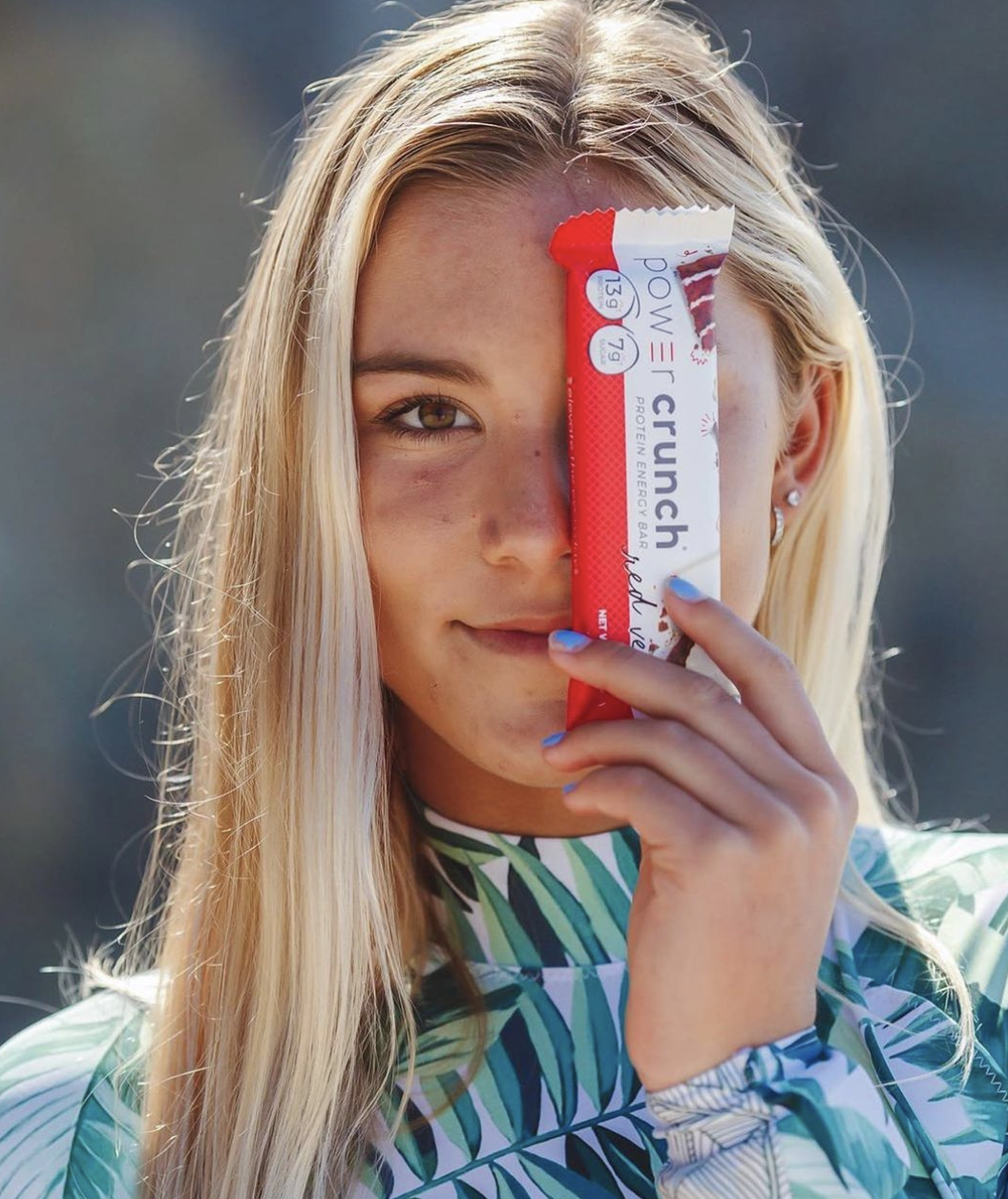
Elevate the everyday. Driven by the need to increase sales and retailer growth beyond grocery channels, Power Crunch invested in a rebrand to move their protein bars from the health aisle to the snack aisle.
THE BACKSTORY
Kevin Lawrence, founder of Power Crunch, created his product out of a personal need; creating a formula his infant son could metabolize in the NICU, made form the high-quality hydrolyzed whey he used as a body builder in the gym. Eureka!
THE INSIGHT
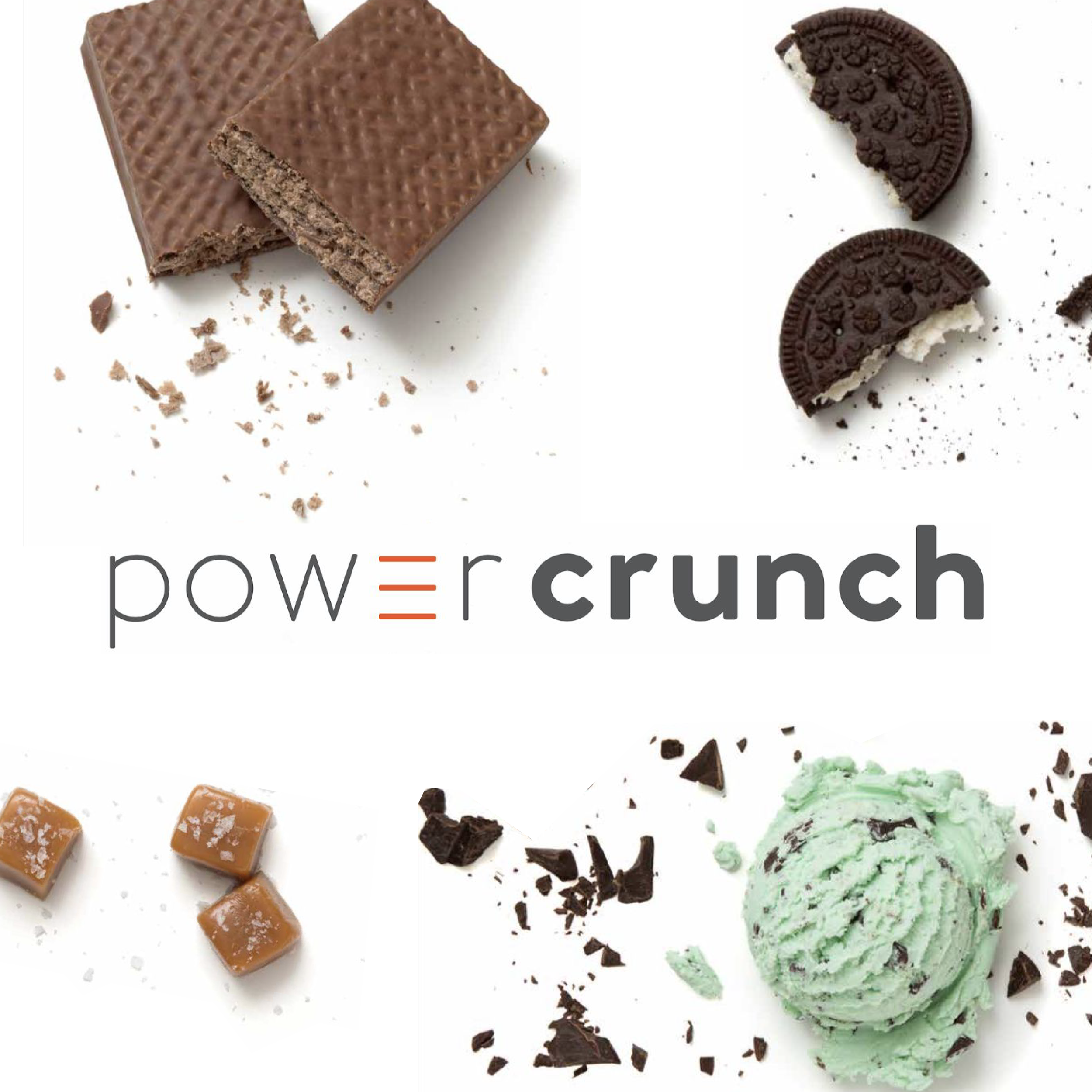
With a unique wafer crisp form factor and extensive line of flavors, this bar was delivering powerful nutritional performance, sure, but was actually winning, among its die-hard fans, on taste and texture.
THE BREAKTHROUGH
Combine the nutritional benefits and enjoyable experience into a brand positioning—elevate the everyday—to attract a new consumer: moms shopping in the snack aisle.


Result = Expansion
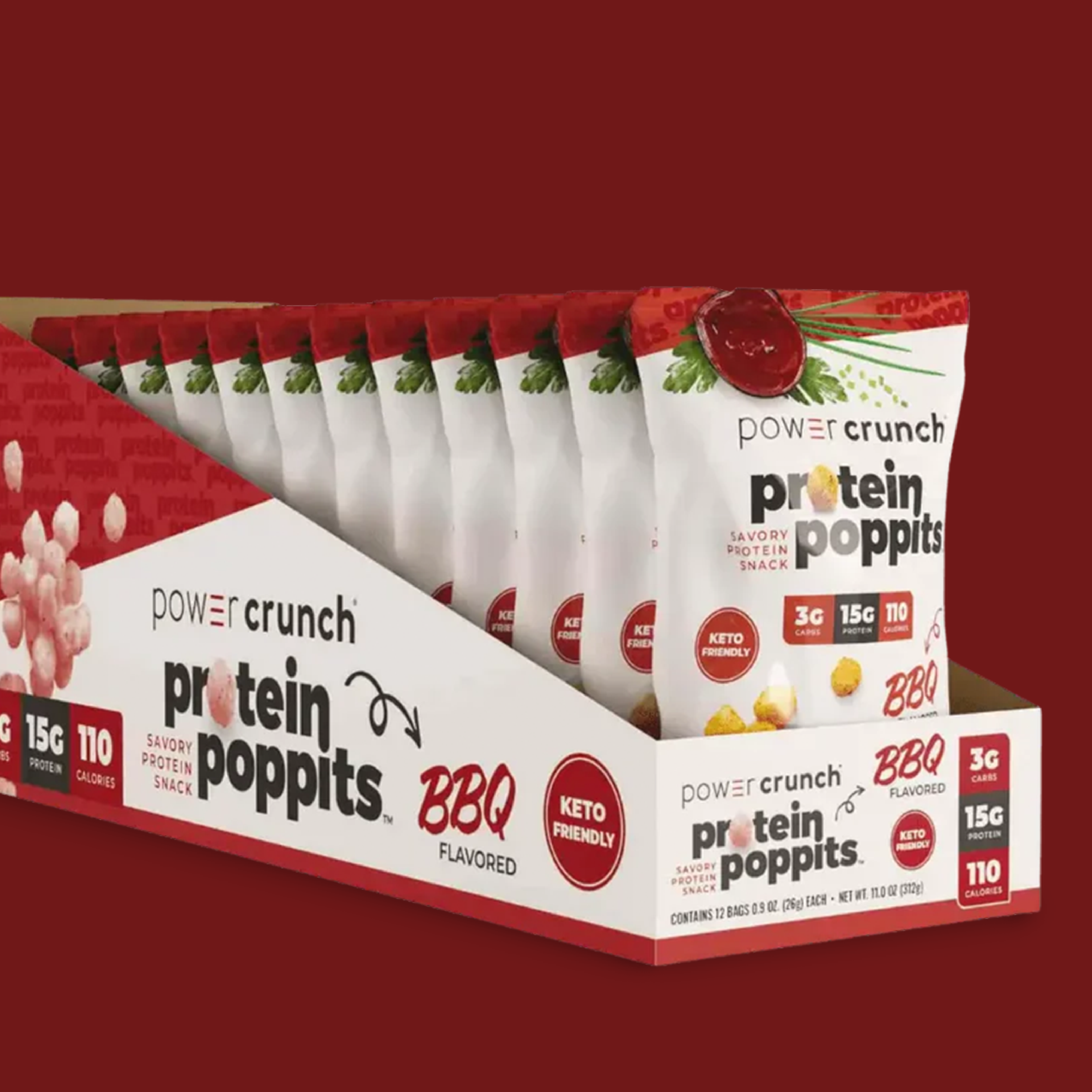
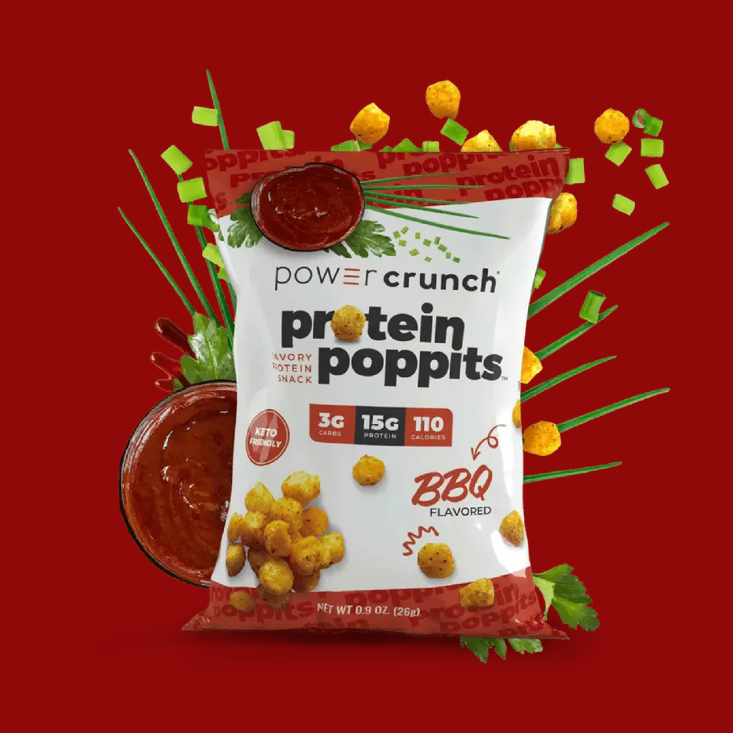
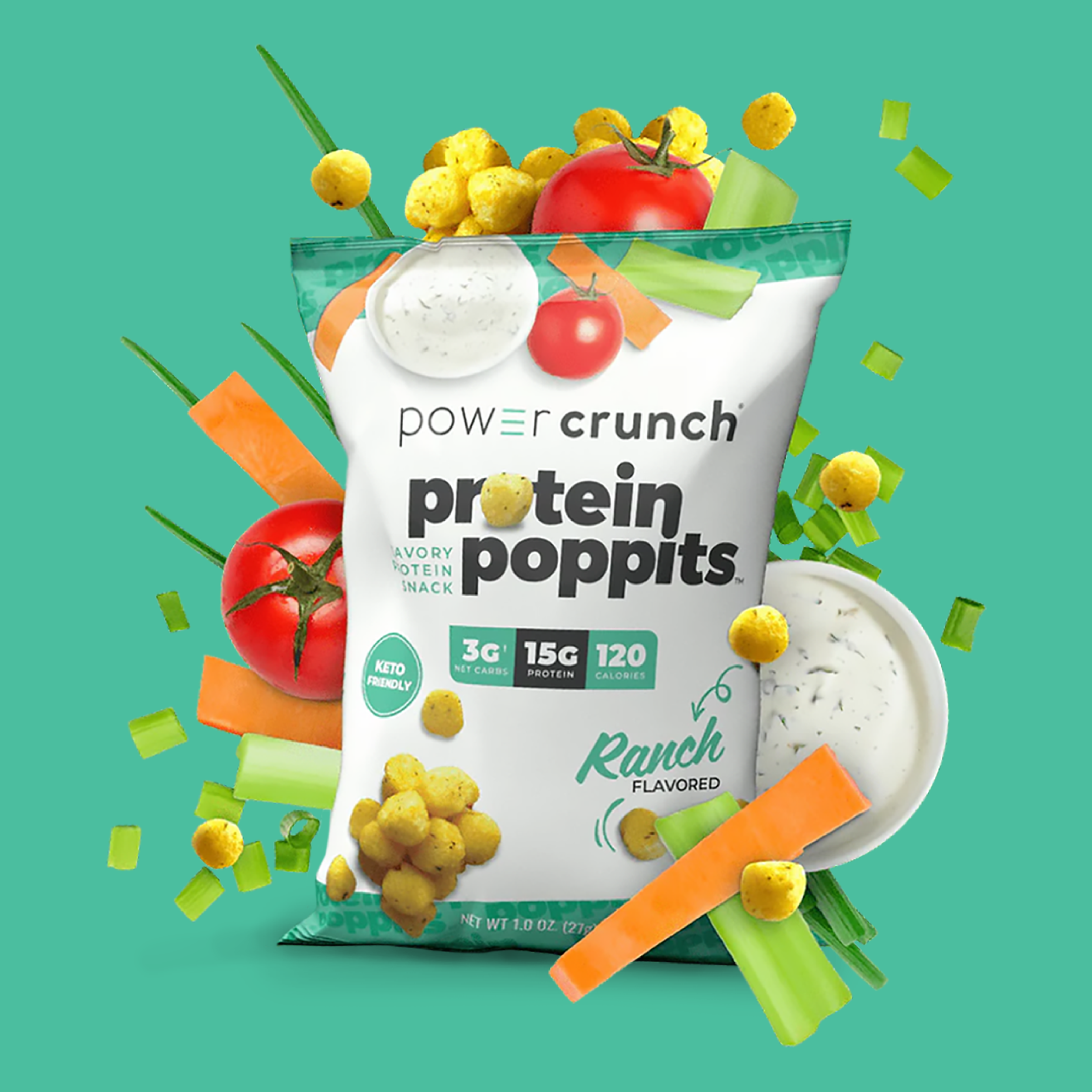
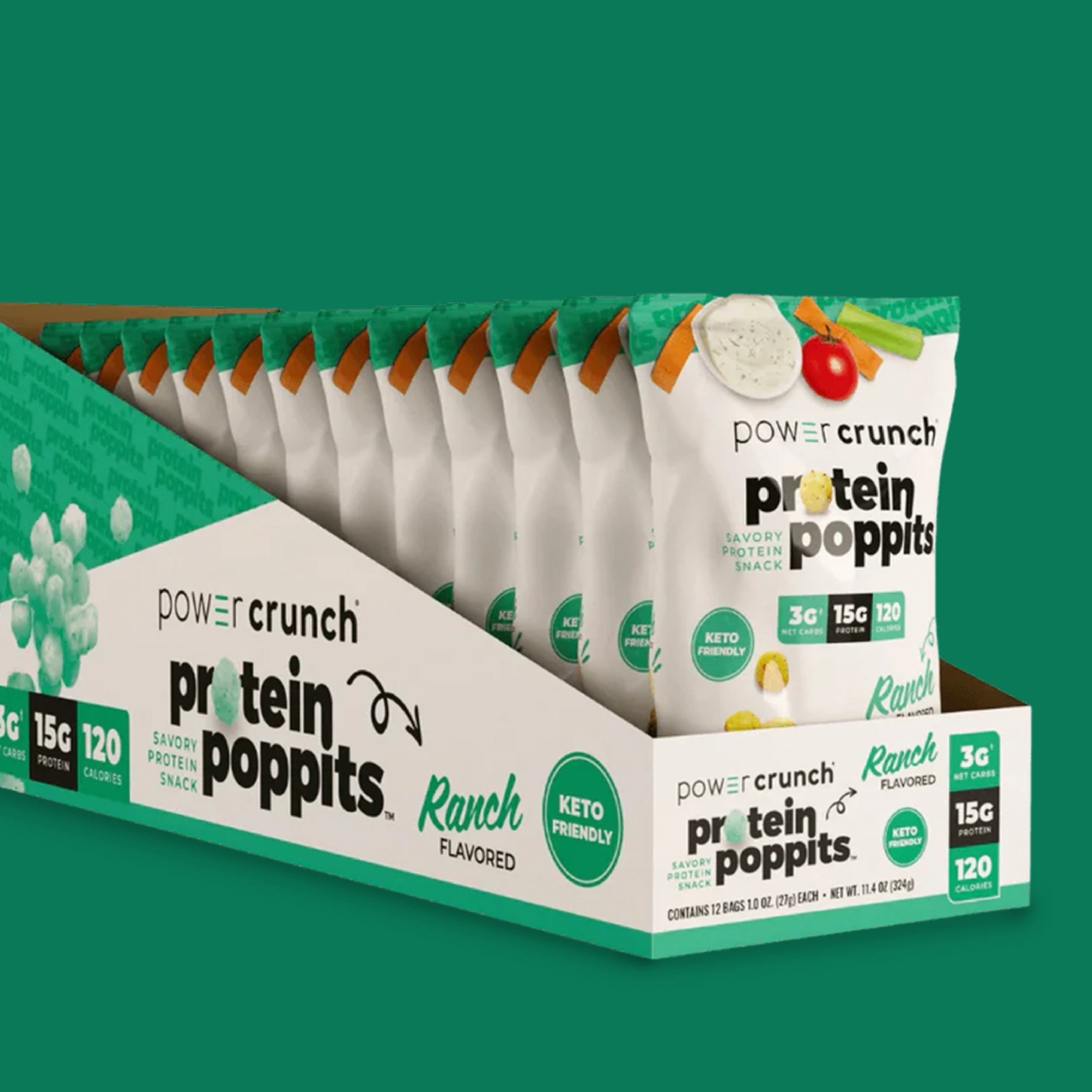
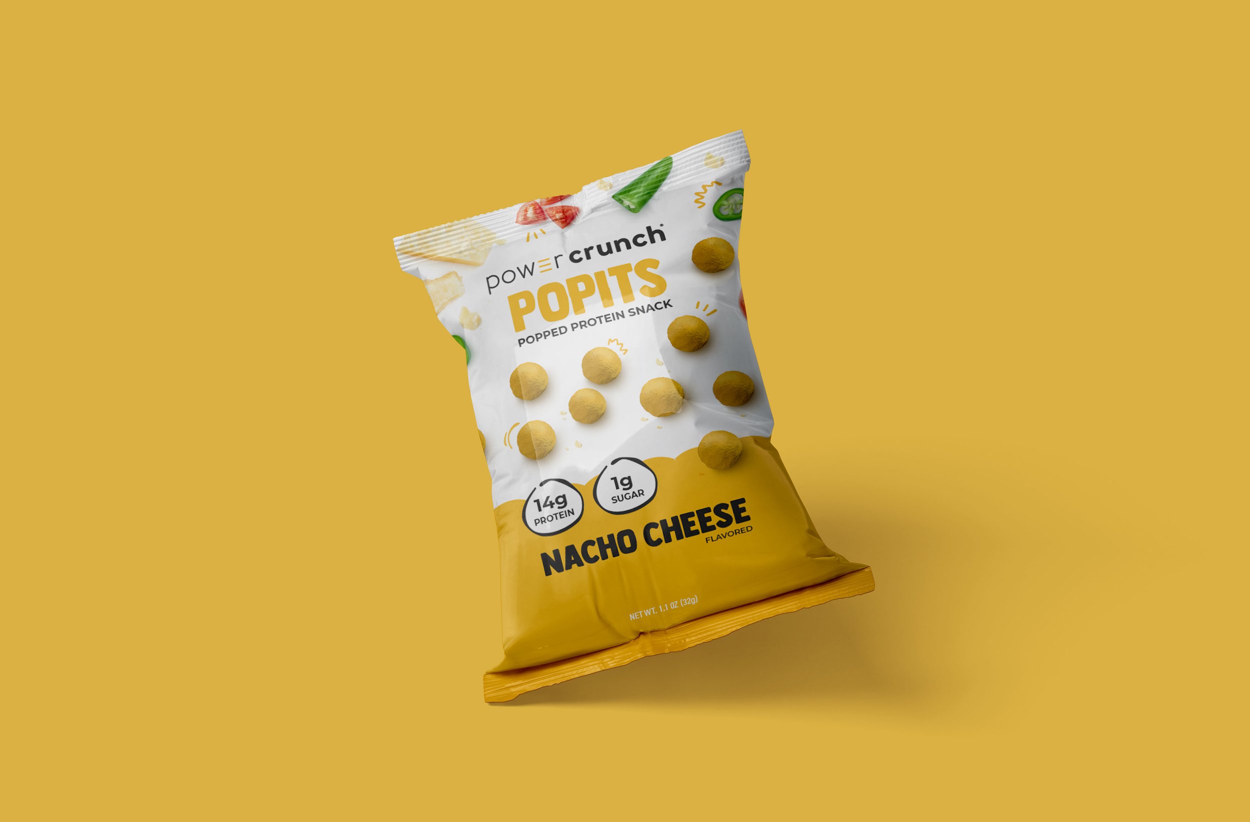
Since our refresh the brand’s distribution has grown (like gangbusters). They have expanded their shelf space not only in the snack aisle with new keto and kid-friendly bars, but across new categories like chips.
Today they distribute DTC and in nearly every big-box retailer.