

Yoshinoya
Quick-service Restaurant (QSR)
Visual Identity // Tagline // Packaging // Collateral
THE ASK
Refresh Yoshinoya’s 125+ year-old brand to clarify what it stands for, elevate its iconic beef bowl, and create a more relevant, differentiated platform for broader growth.
THE INSIGHT
Yoshinoya had the heritage, cult loyalty and signature taste of an icon, but Gyudon was poorly understood and its history wasn’t translating into a modern emotional reason to choose the brand.
THE SOLVE
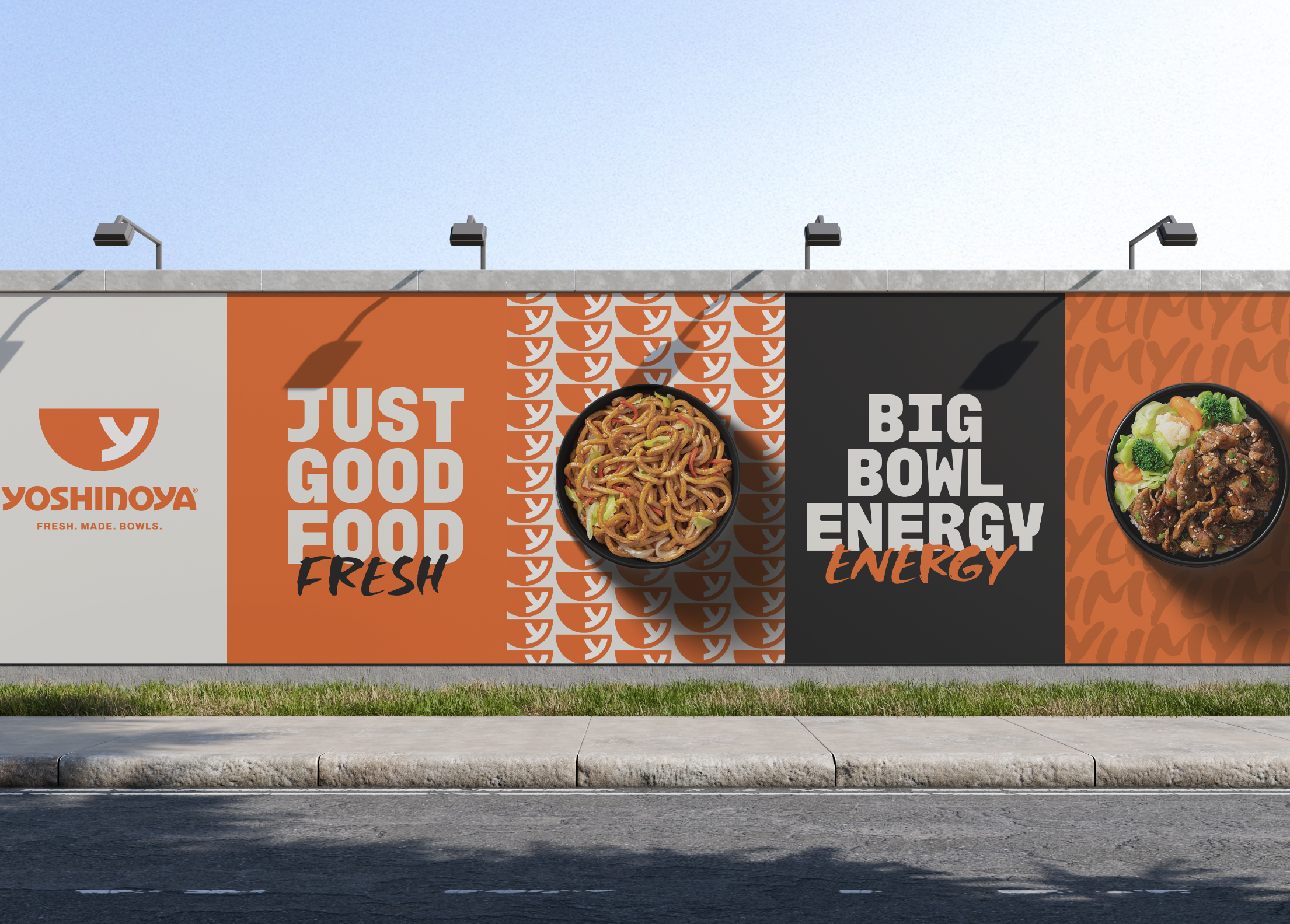
The strategy and creative direction position Yoshinoya as “The Famous Japanese Bowl Experience,” transforming its Japanese roots, secret recipe, generous value and quality obsession into a bold, accessible brand built for everyday craving and lasting relevance.
THE OUTCOME
A revitalized brand that turns Yoshinoya’s 125+ years of heritage into a distinctive, modern experience—making its signature Gyudon easier to understand, strengthening its cultural relevance, and creating a flexible foundation for long-term growth.

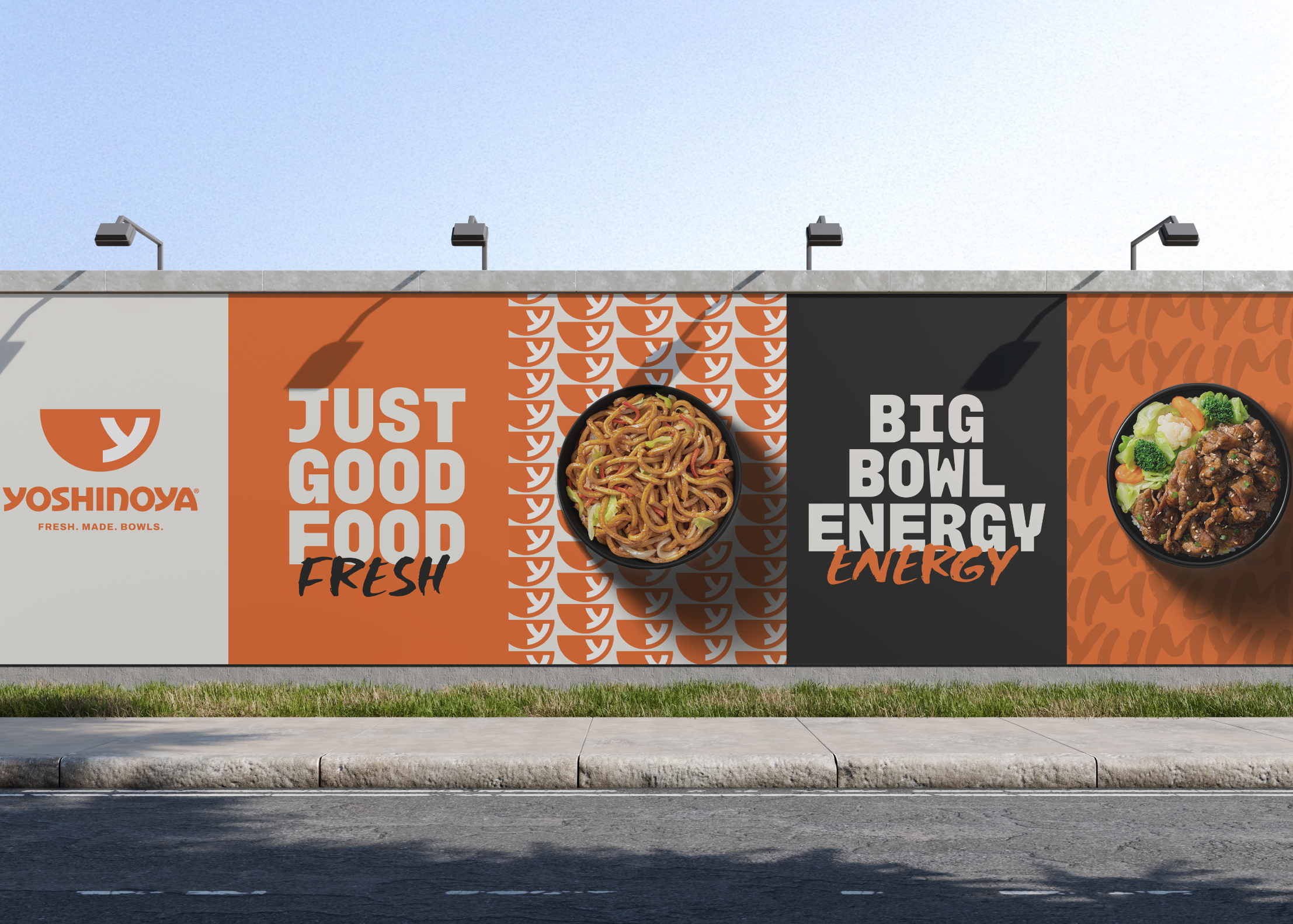
“Fresh. Made. Bowls.” is Yoshinoya’s core identity descriptor.
It is not a tagline or campaign line. It is a foundational brand expression designed to work alongside the logo to create immediate understanding of what Yoshinoya is known for.
The descriptor reinforces Yoshinoya’s food-first positioning by leading with the signals consumers value most: freshness, quality, made-to-order care, and bowl expertise.
In fast decision-making moments, clarity matters more than explanation. “Fresh. Made. Bowls.” helps consumers instantly understand the Yoshinoya experience while creating stronger recognition and consistency across touchpoints.



BRAND PROMISE
A bowl experience that delivers more than expected—fresh, crave-able, and served with care for everyday life.
MATERIALS
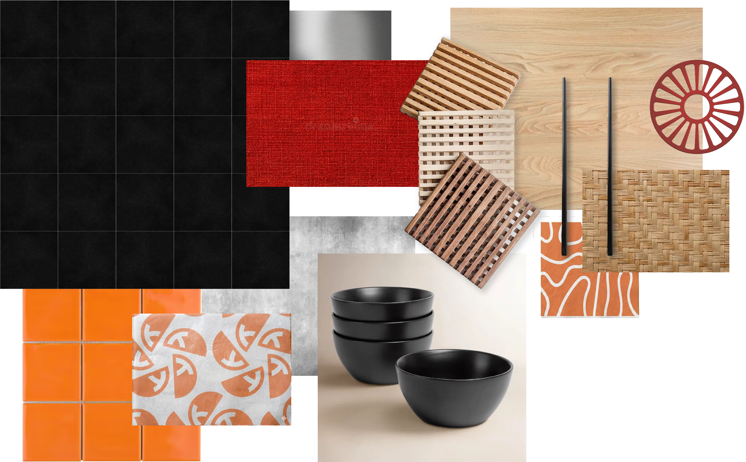
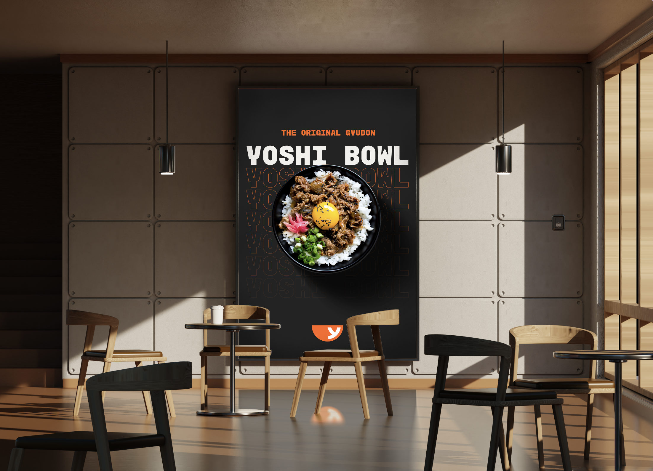
Our material palette draws from Japanese heritage, focusing on simplicity, texture, and refinement. Natural woods, ceramics, woven elements, tile, and matte finishes create a warm, grounded, and elevated foundation.
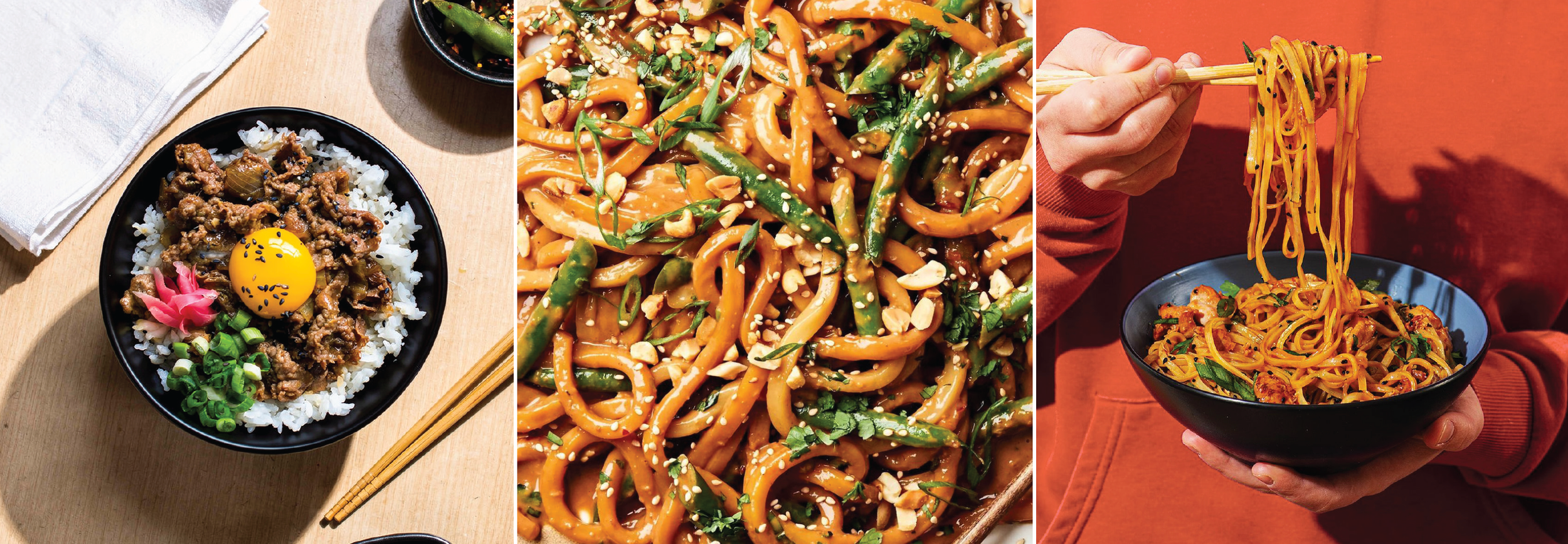
FOOD PHOTOGRAPHY STYLING
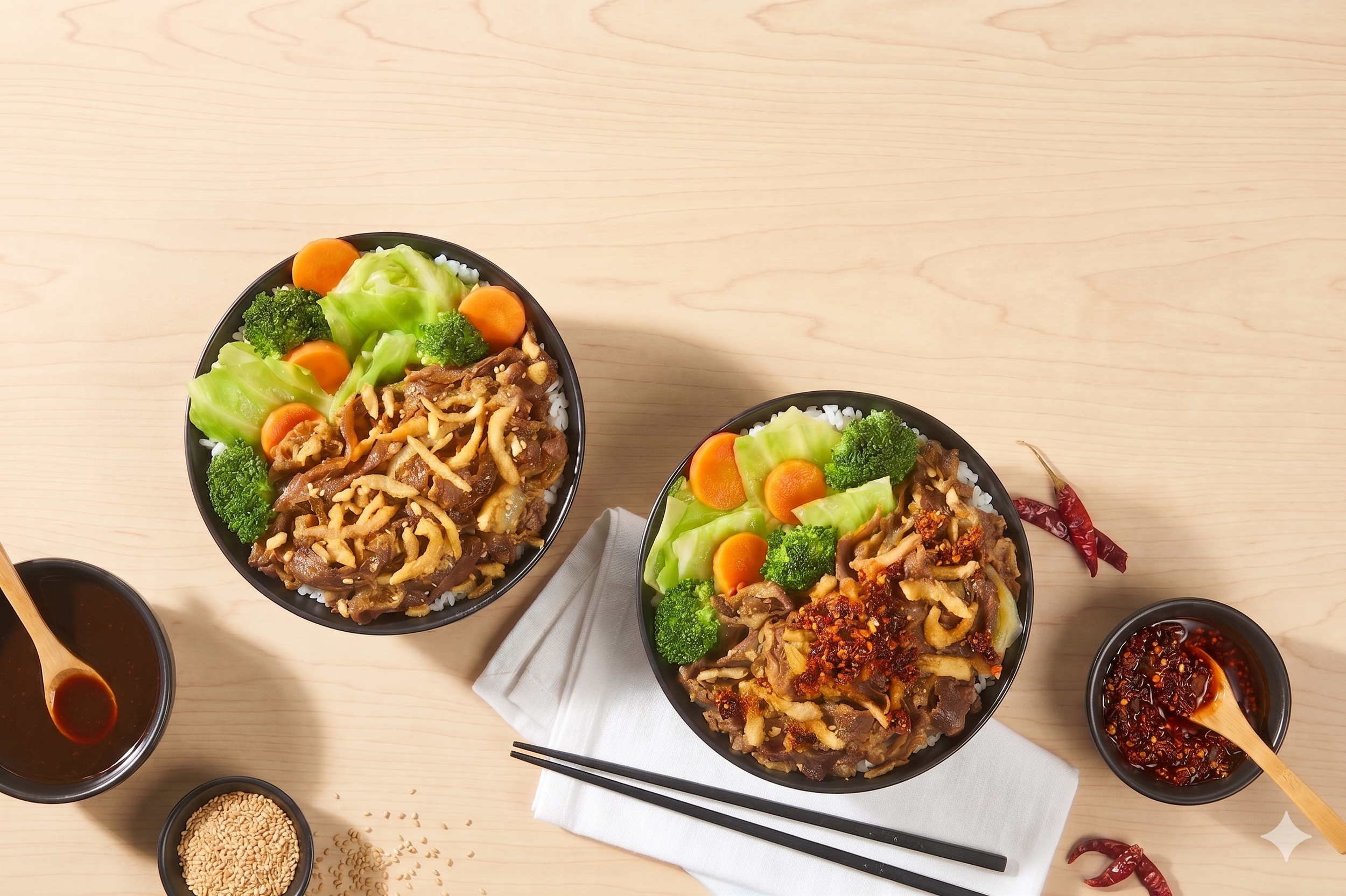
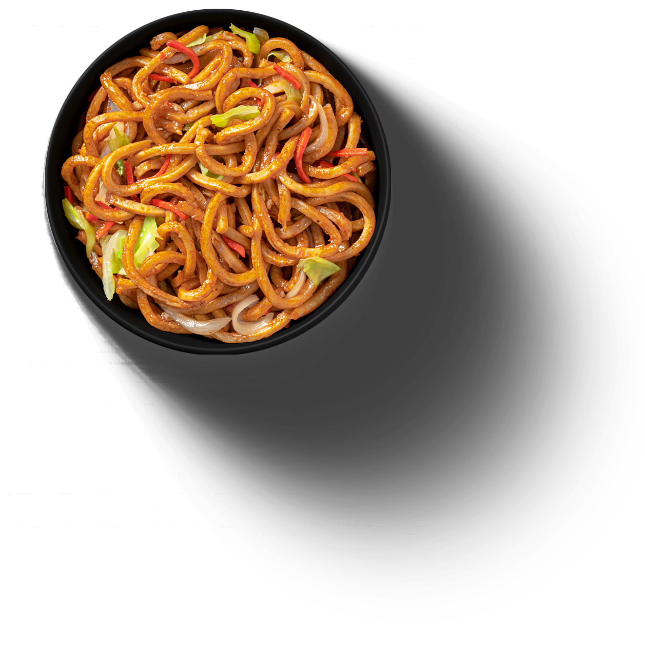
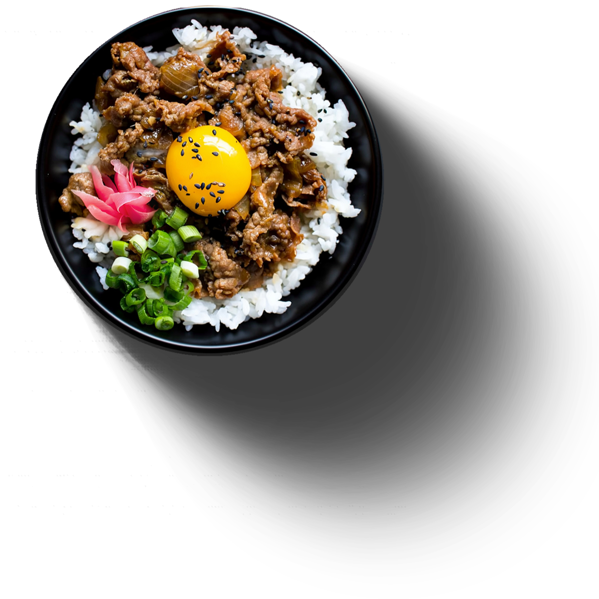
Crisp, and impossible to overlook.
Bold contrast and clean, directional shadows give each dish depth, while quiet, consistent backgrounds let the product command the frame. Ingredients feel vivid and freshly prepared, with the protein taking its place as the unmistakable hero.
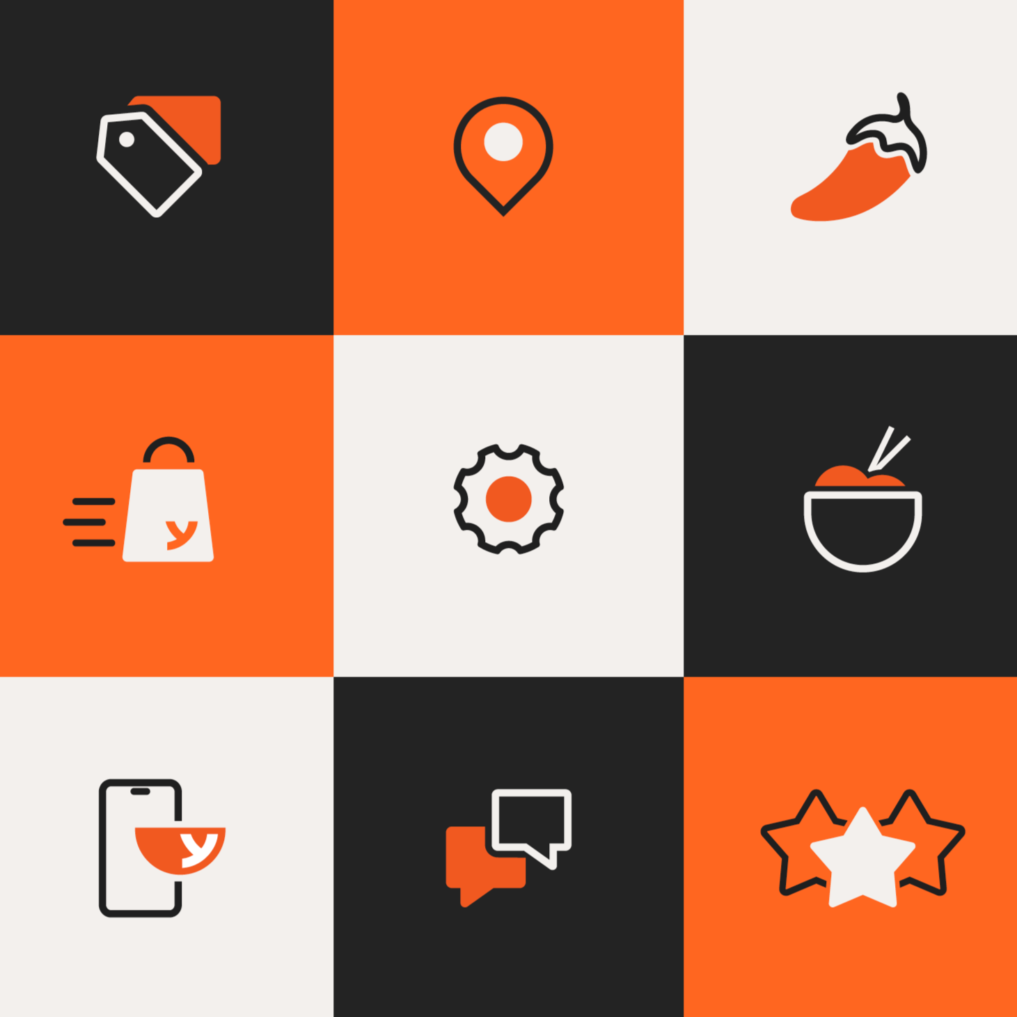
ICONOGRAPHY
Clean, simple, and confidently graphic, designed to reflect the clarity and approachability of the Yoshinoya brand.
The system uses consistent line weights and structured forms inspired by the typography and bold geometric qualities found throughout the visual identity.

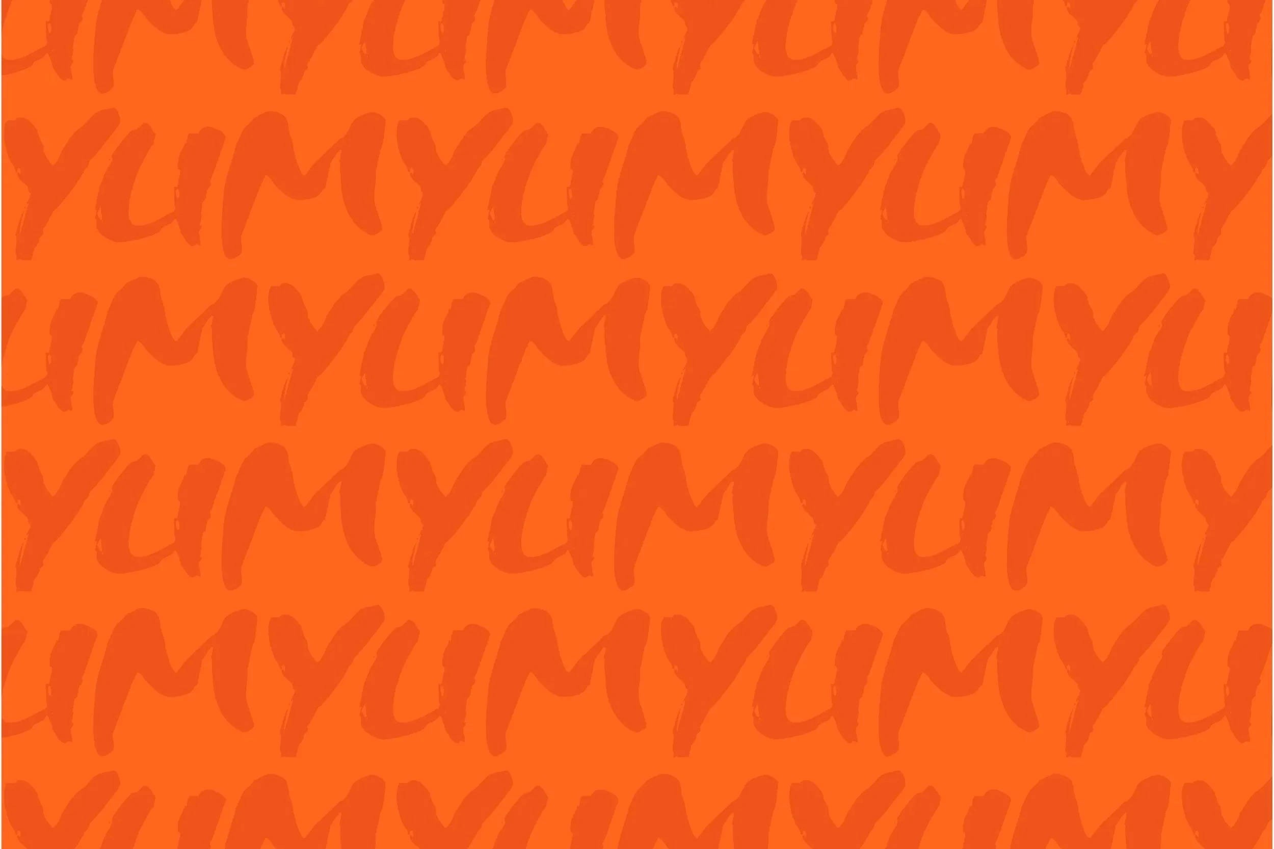
TYPOGRAPHY
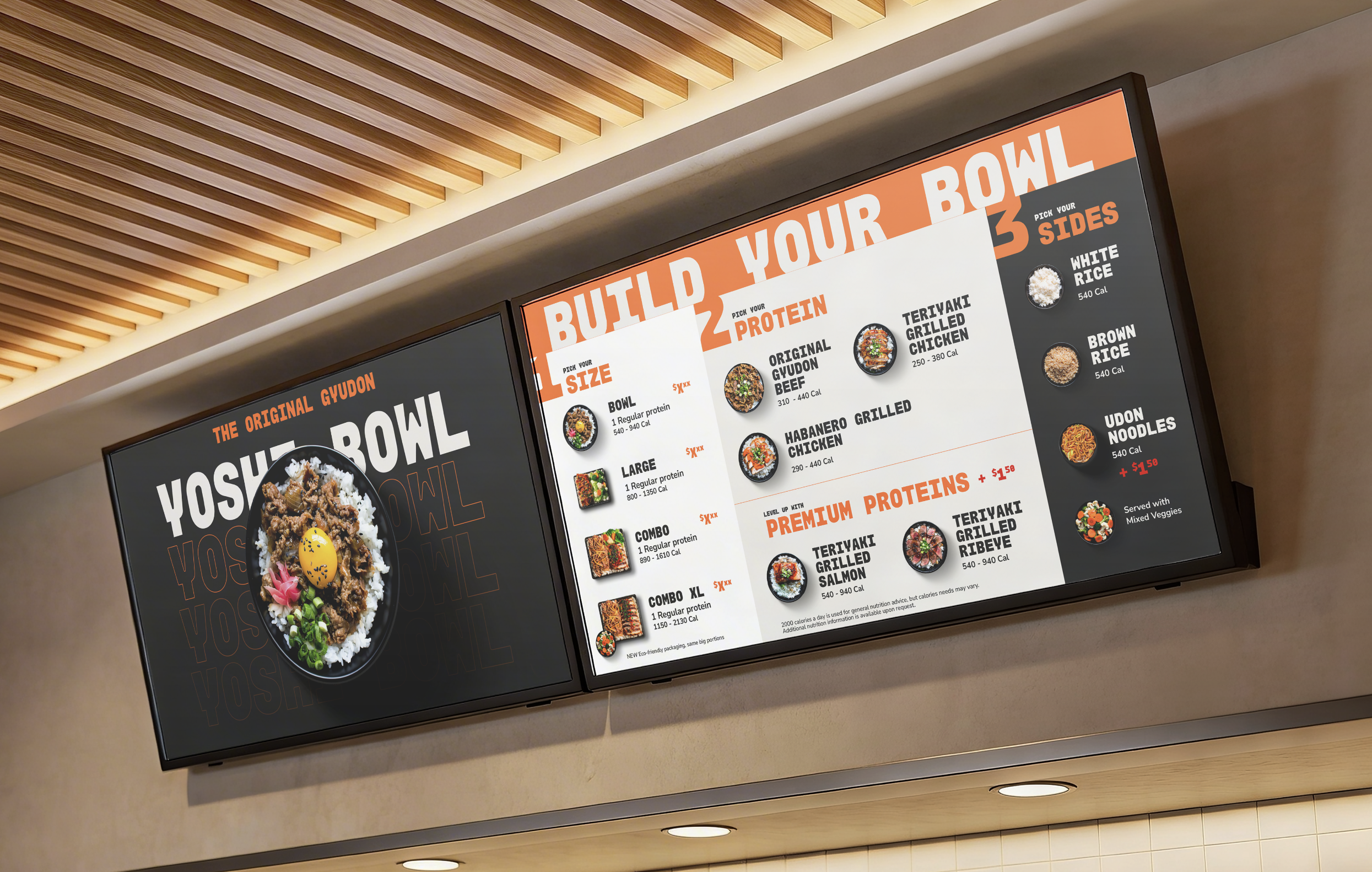
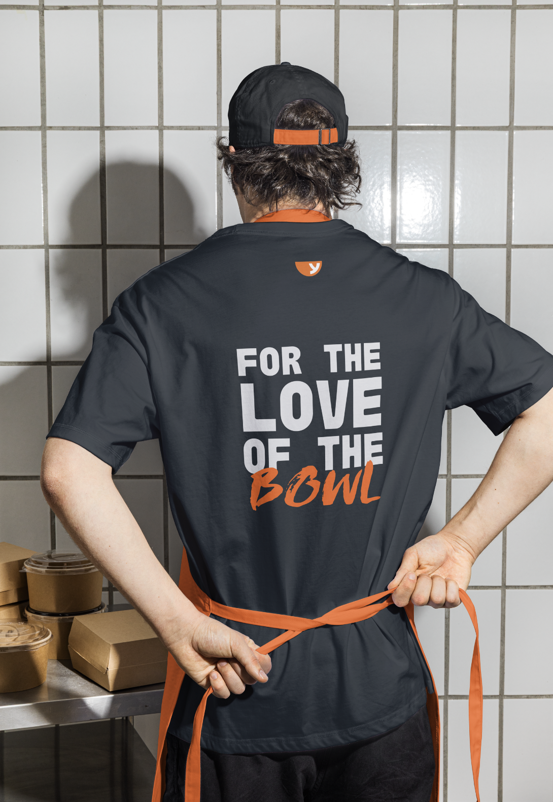
Typography speaks in bold, unmistakable gestures. Monoblock gives each message weight and structure, while Shinano Italic adds a flash of movement, contrast, and personality—turning key words into moments of expression.
PATTERNS
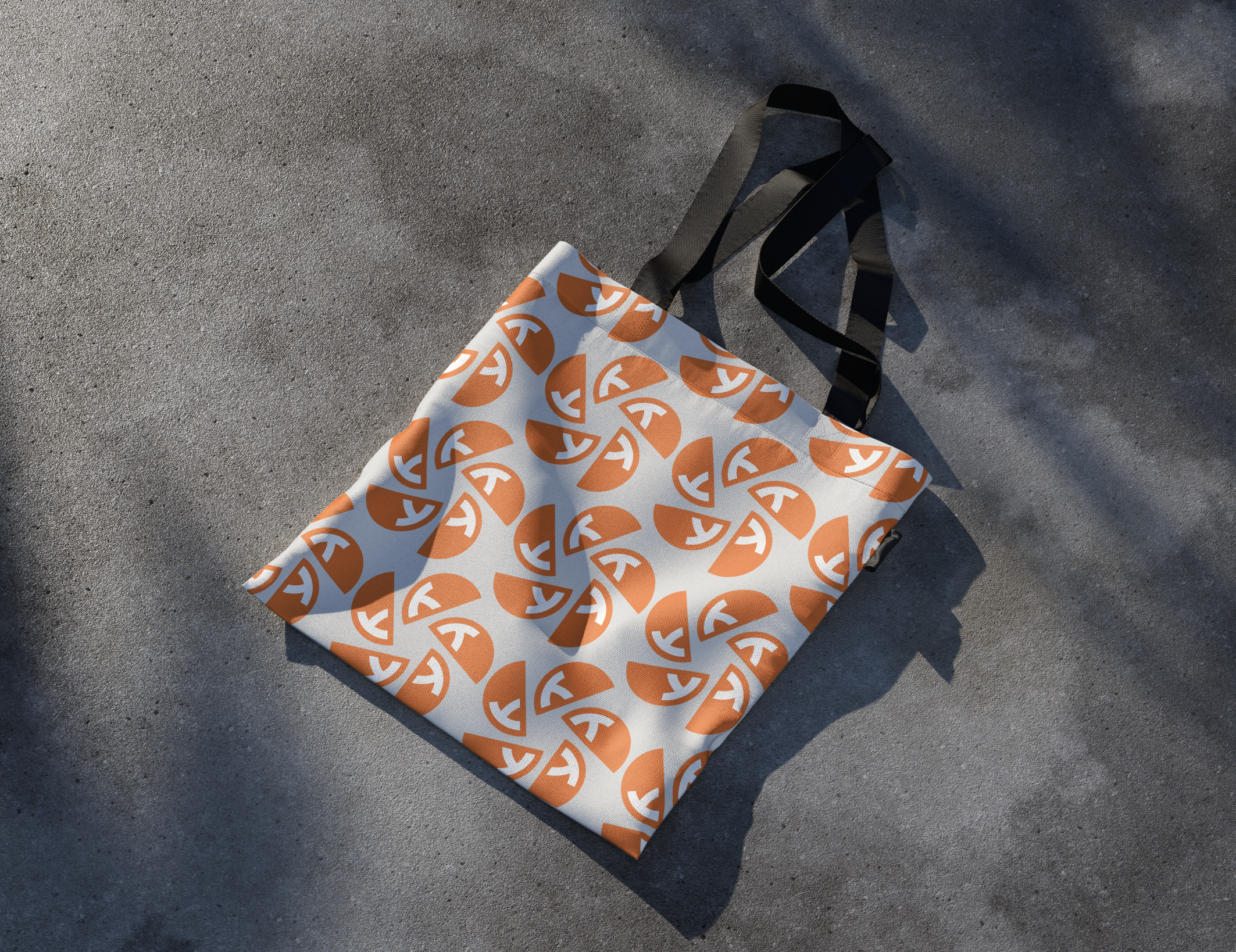
Clean, simple, and confidently graphic, designed to reflect the clarity and approachability of the Yoshinoya brand.
The system uses consistent line weights and structured forms inspired by the typography and bold geometric qualities found throughout the visual identity.



Don’t take our word for it.
Let us connect you to our client partners to learn more about our journey together.
"Clever is my secret weapon and should be any company’s looking for an agency you can trust and know you’re getting the best work guaranteed to have great ROI."
— Michael Parness
Chief Marketing Officer | Outward Hound


