

Metrolink
TRANSPORTATION
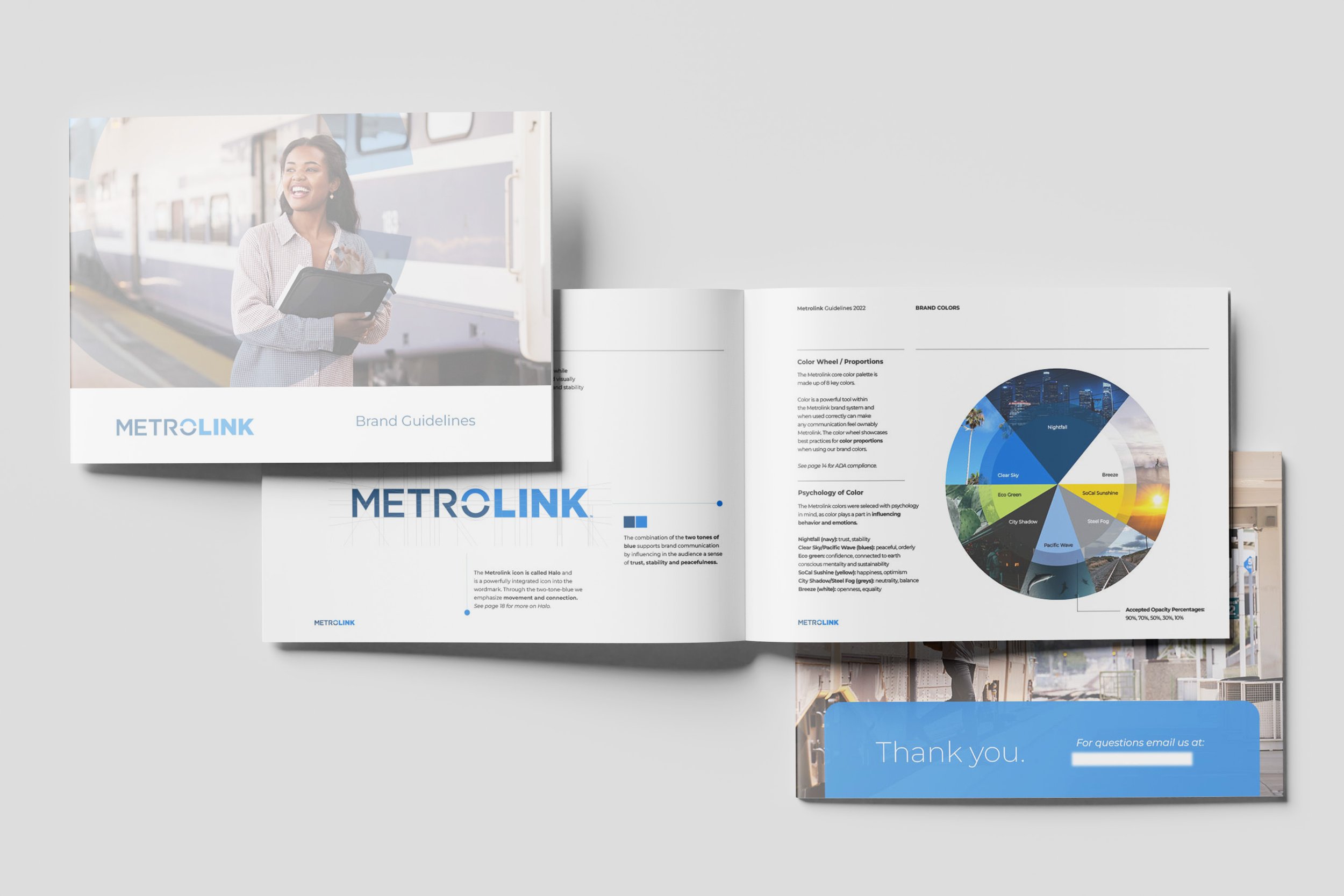
Positioning // Visual Identity // Brand Guidelines // Rollout // Video
From overlooked utility to essential mobility hub. Metrolink's strategic rebrand required a refreshed visual identity that connected its community-driven legacy with today's generation of modern riders.


Employee swag & 30th Anniversary merchandise
The regional rail authority needed to increase brand awareness, clarify their offering, and drive meaningful connection to riders in six counties across Southern California. When the pandemic drove ridership decreases, the agency also became a leader in regaining ridership efforts.


ROLLOUT VIDEO
Art direction for social driven rebrand announcement.


Don’t take our word for it.
Let us connect you to our client partners to learn more about our journey together.
“We did it together and we are the envy of other transportation agencies; I know, they’ve told us.”
— Monica Bouldin
Director, Marketing and Partnerships


